 The following is a guest post written by Justin Broackes, who is Professor of Philosophy at Brown University, and has published extensively in the philosophy and science of color, among many other subjects. We’re very pleased to publish it here as a follow-up to yesterday’s roundtable discussion of what “the dress” has to teach about the philosophy and science of color and light.
Black and White, Light and Dark
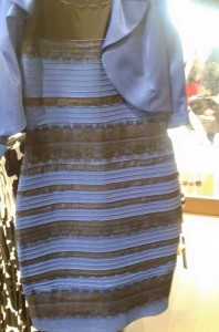
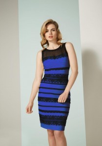
This is a fascinating image! First, it may be worth mentioning that many of the basic questions are not specially to do with colour but with lightness. Take the original Tumblr image (Fig. 1, right) and take one of the publicity photos from Roman Originals of someone modelling the dress (Fig. 2, below), and print them both in black and white–and the first could easily be a picture of a basically white dress (with some second colour, darker), and the other could only be a picture of a basically dark dress, perhaps blue (again, with some darker colour).
The way we ‘read’ such images is extremely interesting—and instructive about the visual system in general. But it may be worth mentioning—in the face of some people who’d like to use them to make big philosophical points way too quickly—that the ambiguities and difficulties with perception of light and dark certainly don’t show that light and dark are an illusion — and the original Tumblr photo doesn’t show that colour is an illusion. They shows that dark things can sometimes be made to look lighter than they are (and sometimes lighter to some people, and properly dark to others)—and that similar difficulties can arise with colours.
Colour Correction and the extremes that can be treated as ‘White’
It’s worth seeing out how special are the conditions in which these kind of difficulties can occur. To get a picture like the original Tumblr photo, one recipe would be to overexpose the picture, and have the camera ‘correct’ or neutralize most of the blue of the dress by setting its “white balance” to something that is almost as blue as the dress itself. You can get pretty much the same effect, starting with an ordinary photo of the Dress — say, the publicity photo in Figure 2 above. If you try adjusting the ‘white’ (using Photoshop or Image Correction in Apple Preview), you can make the appearance of the dress a pretty good match for its appearance in the original puzzle photo. (It helps to zoom in and reduce the two windows, so you see just a middle portion of the dress in each photo: and have the two images next to each other on screen.) Once you’ve imposed the necessary ‘correction’ to the publicity photo, if you then zoom out and see what you have created, you will find that you’ve given the whole picture an extreme yellow tinge. The arms are now much closer in colour to the white background, the lighter regions of skin are so pale they look almost transparent, the contrast between light and shade in the hair is terrific — like a 1960s Pop Art image. That’s what the original Tumblr image would have looked like, if the same exposure had been used and a person had been wearing the dress.
Of course, if a person had been wearing the dress, the camera actually wouldn’t (without a special override) have chosen such an extreme setting for the white point: it’s precisely because the scene is so special that it worked as it did on the camera, and why in turn it poses such difficulties for the viewer. About two-thirds of the image is taken up with a minimally colour-varying object (alternately blue and black), there is a second object (the jacket), but it’s almost the same blue, and those two objects are the only things in their ‘space’ (or lighting environment); there are no flesh colours anywhere; there are surrounding objects, but they are in a completely different ‘spaces’: out of focus, far behind, with evidently totally different lighting (on the right), and almost impossible to ‘read’ (on the left). The dress itself does not become less puzzling: though at first it might seem that a person was wearing it (just with arms and legs out of view), a second look shows it to be almost flat (and sometimes concave), perhaps hanging on pole with a T-bar at the top. These are just the kinds of scene for which we should expect colour constancy to be impossible. Think of photographing large expanses of uniform (or two-coloured) curtain material (each in particular shade of red, orange, etc.), from close up, using a camera that automatically compensates for any general tinge in the image.
Colour Constancy: Two possible rules
The interesting thing is not, I think, that in these circumstances colour constancy breaks down, but that so much is maintained at all. But how does colour constancy operate when it does, and on what bases? In the following figures and commentary, I’ve given the beginnings of an account of why people looking at the Dress photo sometimes see white-and-gold and sometimes see blue-and-black.

The first option is actually perhaps the easier one to understand: setting a ‘white point’ to the brightest region in the scene is the kind of strategy that often works (and that Edwin Land, in his famous Retinex theory (Scientific American, December 1977) thought we standardly employed—perhaps more than we actually do). There are technical and principled difficulties with the theory that Land presents, but it may yet be a good start. On the other hand, when people see blue and black (correctly, as it happens), how are they doing it? Land’s rule certainly gives us the wrong answer in this case. One option is that they use the darkest regions (from the ‘black’ of the dress) to set the neutral point: and maybe that’s the right answer. (We might therefore try a kind of ‘inverted Retinex’ rule: take the darkest region, or some average of the several darkest regions, (which of course typically in a real scene won’t have a zero score in the R, G and B channels, but will be tinged in some way), and set that to some standard and low ‘neutral’ value (say, R = 0.05, G = 0.05, B = 0.05).) That is the kind of suggestion I’ve worked with in my caption to the Figure, and it seems to fit the people seeing blue and black. But whether the visual system really does more generally operate according to such a rule is another matter—something for which I don’t have the empirical information.
Often, with natural scenes, the difference between the implications of the Retinex and the ‘inverted Retinex’ rules will be small; but with scenes like this (where the general coloration is very marked, but the darkest regions have a different colour character from the remainder of the scene) there is a big difference between the implications of the two rules. And this very wonderful image suggests that, even if neither rule has much chance of being simply and straightforwardly correct (there are so many additional factors that Land omits and this isn’t the time to mention), yet there may be some significant truth to be found in both of them.